SurveyMonkey Homepage redesign
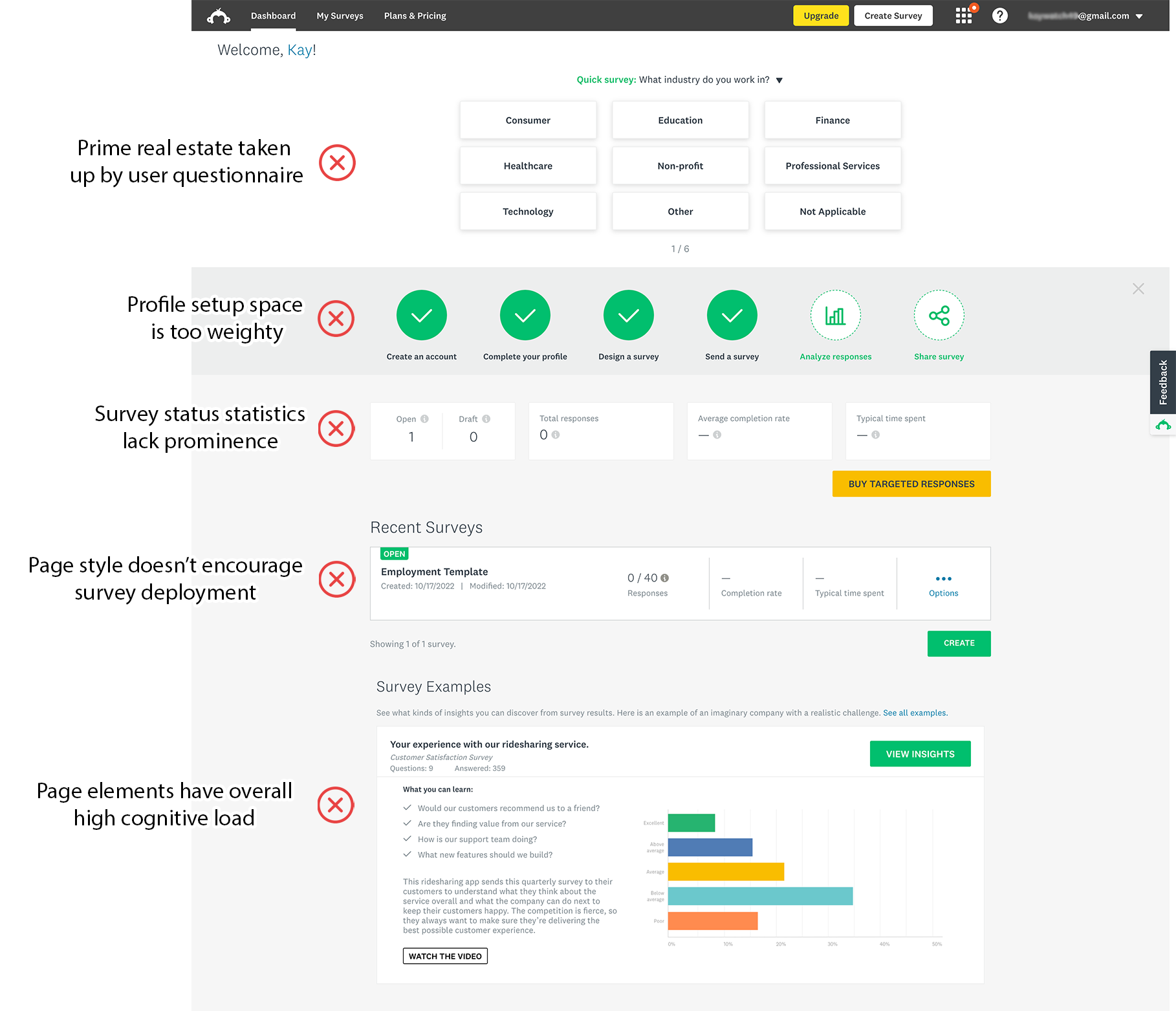
The SurveyMonkey logged-in homepage—the first page any user sees after logging in—was not performing.
Even worse – users had begun to complain about it; both to customer service, and on social media.
Involvement
• My role: Content Strategist
• Cross-functional team: Product Design, Engineering, Dev, QA, User Research
The plan
Design a simplified, modern and surveys-first homepage. Create user workflows that help people understand the status of their work, and encourage survey deployment.
Homepage before redesign
Initial designs and qualitative research
I partnered with Product Design to create initial mockups, and then User Research interviewed a cohort of users:
free account users, with 10 or fewer surveys, who had been on the platform for less than 90 days.
User feedback for the initial designs was largely positive, but also provided vital information that was used to tweak the design.
MVP DESIGN
Drawing on learnings from qualitative research, we were able to simplify the design even further.
Instead of a split CTA that contained a menu and confused users, we simplified the CTA, and moved secondary actions to a meatball menu.
For ease of understanding, at-a-glance information was color-coded, and line icons were added.
Finally, a toggle and coachmark were added to the page so we could learn more about users who wanted to switch back to the old homepage.
the details
survey cards
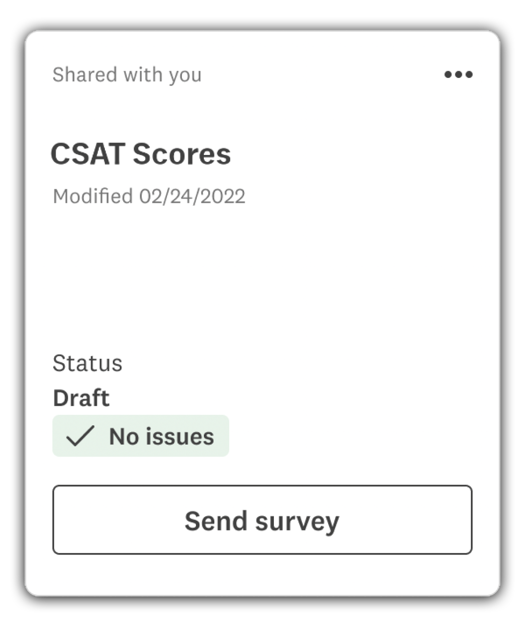
With cards, users can see survey status at-a-glance and address potential issues, right from the SurveyMonkey Homepage.
The primary suggested action in the CTA changes depending on survey status (draft, open and receiving responses, closed). In this case, it takes the user to the survey deployment page.
Tapping any unlinked space takes the user to the beginning of the workflow for survey development, where a user can edit questions.
The unobtrusive meatball menu houses secondary actions that a user may want to take.
homepage toggle and feedback Modal
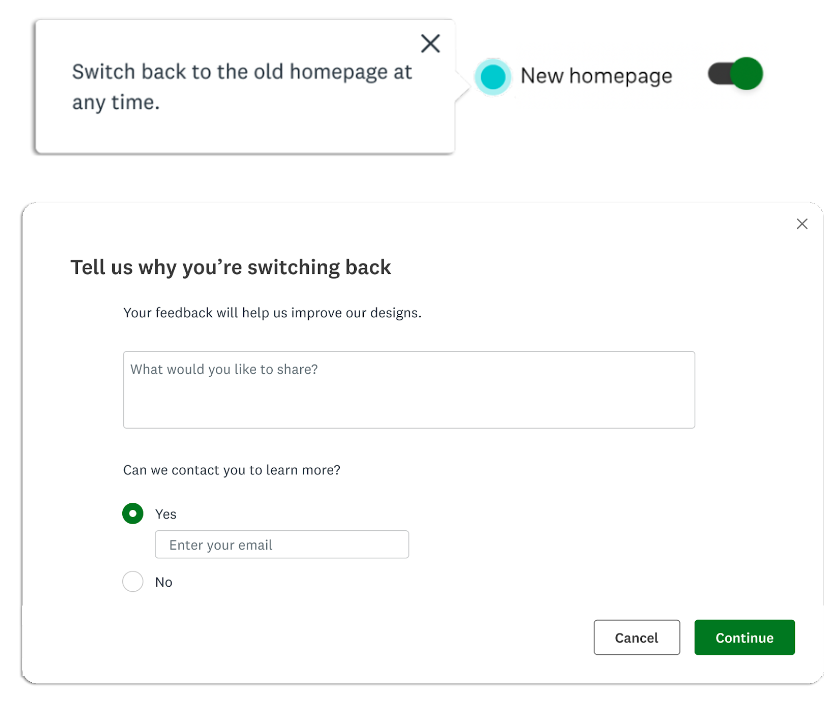
A coachmark and toggle were employed to show users how to switch back to the old homepage should they wish to.
We wanted to know why a user would choose the old experience over the new one, so we added a feedback modal, which was surfaced after a user switched.
Feedback gathered informed design changes, and alerted us to engaged users who may want to take part in future user research.
Error states
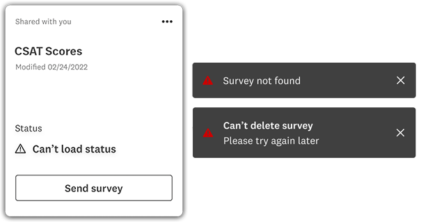
Survey status error message: Created to ensure survey cards can still load when survey status events fail.
Survey deletion toasts: MVP toasts were very basic due to limited capabilities, but deletion toasts were required, even at this early stage.
The results
A phased rollout to SurveyMonkey users began in Q2 of 2022.
We were impressed with results in our two most important metrics—survey deployment, and use of the primary CTA.
12% increase in survey deployment
75% of users chose the primary CTA to take action


